


今回の記事では、SWELLカスタマイズ/サイト全体設定/基本カラーのやり方を解説していきます

このサイト全体設定の項目も、ただの設定作業の解説だけでなく SEOに心理学とも密接に絡んでくるか所もあるので、合わせて解説させて頂きます
この記事を読むと、SWELL基本カラーの設定のやり方が分かります
また色の選び方の参考になります
【SWELLカスタマイズ】サイト全体設定/基本カラーのやり方
さっそく、SWELLカスタマイズのサイト全体設定/基本カラーについて解説していきますね
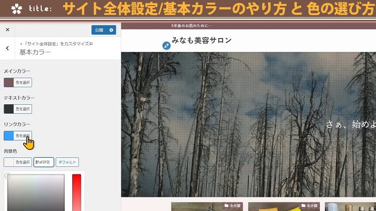
では、ダッシュボードの方から、外観にあるカスタマイズを、クリックしてください
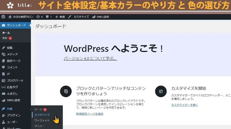
コチラのカスタマイズの画面が開きましたら、サイト全体設定をクリック
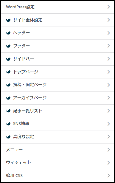
サイト全体設定が開きます
サイト全体設定では、コチラの10項目について設定していけます
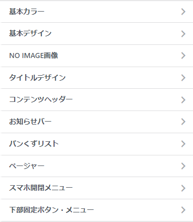
まずは、基本カラーの方から設定していきます
基本カラーをクリックしてください
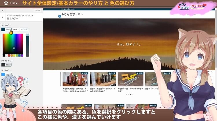
こちらでは、サイト全体のカラーを設定していけます
個別には、他の場所でも設定できますが、全体のデフォルトとなるカラーをせっていしていけますね
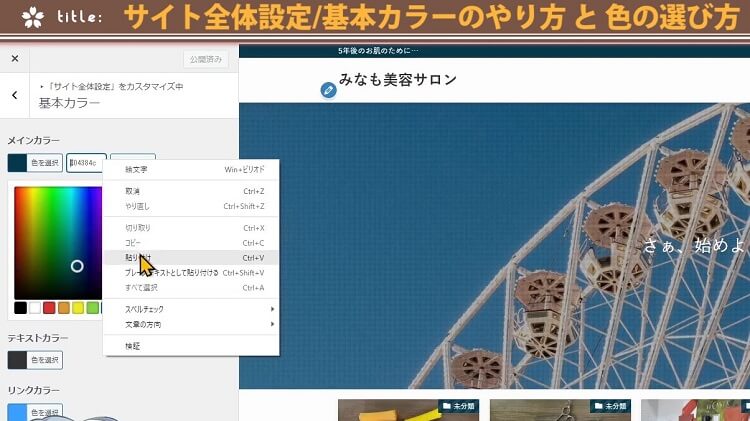
各項目の色の隣にある、色を選択をクリックしますと、この様に色や、濃さを選んでいけます

ただ、これたけあると、色だけにいろいろ迷ってしまうね
色だけに…?
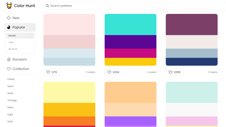
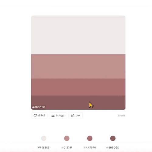
配色に迷った時には、カラーパレットツールのサイト
相性の良い色を組み合わせたものを紹介してくれる、カラーパレットツールのサイトがあります
代表的なものを4サイトほど紹介しますね
まずは Color Hunt です
4色の相性の良い色の配色を提案してくれます かなり多くの組み合わせをご提案してくれますね
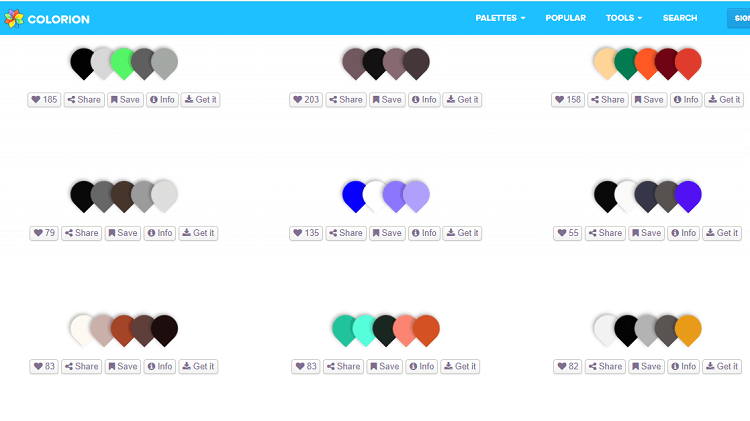
次は COLORION です
Color Huntと同じ感じに4色から5色の相性の良い色を逆しずく型デザインで提案してくれます
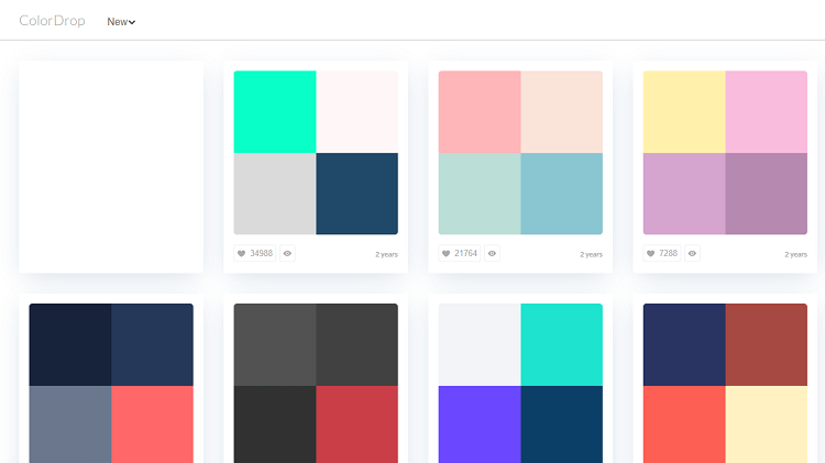
次は Color Drop です
こちらも4色の相性の良い色の配色を提案してくれます
最後に、日本語サイトでサルカワさんのサイトです
コチラは日本のサイトで、4から5色の相性の良い色と、その割合を紹介してくれてます
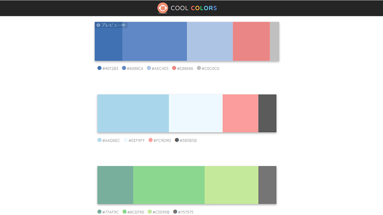
なぎのブログの配色も、こちらのサルカワさんのサイトを参考にさせて頂いて作らさせて頂いてます
色の印象と効果 選び方
どちらのサイトでもカラーコードをコピーできるようになっていますので、コピーさせて頂いて、SWELLの基本カラーの所にペーストしてあげると、色がプレビューされます
配色のバランスは、配色紹介のサイトを見れば簡単にセンス良くつくれるのでやってみてくださいね
あとは、自分のサイトで扱うジャンルと、サイトの色が合っているか?という点に気を付けて色を選んでみてください。色は、視覚的にも心理的にも大きく影響します
私の本業の一環としてカラーコーディネートの勉強をした事があります
なので、色の選び方や、色の与えられる印象をみなもちゃんの、サイトの色を設定しながら、少し解説してみたいと思います
この配色にしたいな
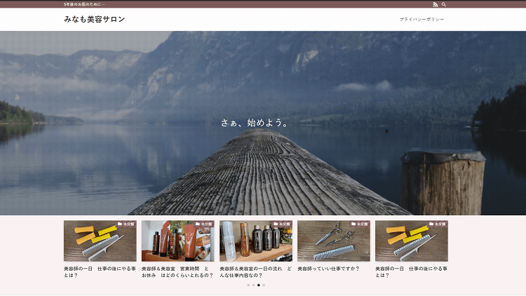
ずいぶん落ち着いた色を選んだね
うんうん、私の取り扱いたい商品が、ややお値段のする化粧品などを扱いたいので、ポップな色よりはシックな色がいいと思って
取り扱う内容と、サイトデザインの相性や、想定する読者さんのユーザビリティを考えて選択したのね
よく考えられてて、いい選択ですね
色は、想像以上に、印象を伝えたり、心理的な効果をもたらすことが出来ます
私のイメージカラーに合わせて水色もいいと思ったんだけど、名だたる化粧品メーカーさんが水色の色を多く使っているシーンは、主に夏用ファンデーションや、日焼け止めの商品が多かったので、使いませんでした

多くの化粧品メーカーさんは、モノトーン、もしくは赤みを含んでる場合が多かったので、赤みを含んだ落ち着いた色を選択してみたわ
自分のイメージカラーを作るのもアリですが、同じジャンルの上位の競合サイトを分析してみるのも大切です
化粧品や病院、ブライダル関連は、白いイメージだったり、中華料理店は赤でしたり、ラーメン屋さんは黒をベースにするとおいしそうに見える効果があるようです。
皆さんが、業界ごとにイメージしやすい色もありますし、逆に○○と言えばこの色 というアピールも出来ます
イメージカラーを設定するのもいいよね
マクドナルドやコカ・コーラはかなり印象に残るよね
読者さんが居心地がよく、違和感がないサイトだと滞在時間ものびてSXO対策につながります
中華料理店が青だと、ちょっとイメージ違うね
青い食べ物って、食欲を落とせる効果あるみたいだし
他にも、上位表示されているサイトには、それだけ読者も集まっている理由が隠れている場合もありますので、イメージカラーも被りすぎない程度に、上位層を参考にさせて頂くといいかもしれないわね
色の印象は 重さや 硬さ 温度感をつたえることも出来ますし、人の心理に影響し行動経済学にも通じます
赤を基調とするお店にすると滞在時間を減らす効果や、緑を基調にしたお部屋では睡眠時間が長くなる傾向がありますね
また同じ色でも、春色 夏色 秋色 冬色など少しの色合いの変化で、合わせにくい色同士が合う様になったり、印象を大く変えることが出来ます
色については、本職の美容やデザインで培ったカラーコーディネートの知識がありますので、後ほど専門的な動画を出したいと思っています
面白い話ですが、なぜ山小屋の屋根は赤いのか?など巧みな色使いについてもお話していけたらな、とおもいます

山小屋の屋根の赤は意味があったんだ
なんかおもしろそうね
では、リンクの色は、この後解説しますが、まずはメインカラー テキストカラー、背景色を自分のサイトに設定していきましょう
こちらで、カラーコードをコピーしまして、SWELLの各項目に貼り付けていきます
貼り付けて、エンターを押しますと、右側の画面にプレビューされます
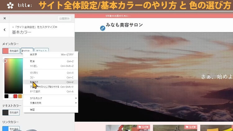
引き続き、背景色も同じようにやってみます
テキストカラーは、特にこだわりがなければこのままでいいです
2色変わるだけでも、印象が変わりますね。いい感じになりました
リンクカラーは絶対青 最もクリックされる青とは?
リンクカラーは、どうすればいいの?
リンクカラーについては、絶対に青にしてください
青以外にすると、読者がリンクと言う事に気が付けなくなります。リンク先にも行ってもらえるチャンスをみすみす逃すことに繋がります
なので、リンクは絶対に青です
私もブログを始めるまで気が付かなかったんですが、リンクの青ってそれぞれのサイトで違うんですよね
そうなの?
例えば、Amazon 楽天 グーグル Yahoo!など、リンクの色はそれぞれのサイトで違います。さらにパソコンとスマホで色を変えている場合もあります
因みに、Googleは心理的な実験を行ったうえで。最もリンクをクリックする率が高い、青を取り入れてるみたいですよ
Google以外のサイトは、時々リンクの青色を変えたりしてますが、Googleはここ数年変えてはないので、最も効果的な青なのかと想像できますね
興味ありましたら、動画説明欄にGoogleのリンクの色のカラーコードをを載せておきますので参考にしてください
お好みもあるかもしれませんので、お好きな青を選んでみてください
基本カラーについては以上になります
各色が決まりましたら、一旦、上の公開ボタンを押しておきましょう
公開しないで、カスタマイズを離れてしまうと、保存されていませんので、ご注意です
【動画版】基本カラーやり方&色の印象/効果
今回は、【SWELLカスタマイズ】サイト全体設定基本カラーのやり方と、色の効果について解説させて頂きました
その他、SWELLカスタマイズに関して以下の記事を執筆しました
興味ありましたら、チャンネル登録 してお待ちいただけると嬉しいです
見てもらえる人が増えると、動画制作のモチベーションが上がります
最後まで見て頂きまして、ありがとうございました
この記事は、SWELLカスタマイズの解説シリーズ2作目になりまして、SWELLのカスタマイズに興味ある方は、再生リストにまとめてあるので、今後の投稿も見て頂けると嬉しいです
サイト全体設定では、WordPressサイト全体のデザインを大きく整えられる項目なんですが、たくさん項目がありまして、分かりにくい事も多いですよね?
SWELLのデザインの多くは、カスタマイズ、そしてこのサイト全体設定で行うことが出来ます。
なので、このシリーズの動画で、余すことなく解説していきたいと思います
ただ、SWELLはとても高機能で、いろいろな設定を行えるのですが、機能が多い分、どこでどの設定をしていいのか分かりにくい面もあります
時々WordPressや SWELLのデザインや設定を少し変えたい時があると思いますよね?
でも、だけど、あれ?この機能の設定ってどこで設定するんだっけ?って思う事ありませんか?
よくあるね
そんな時に、すぐに解決できるように、私のチャンネル内検索で答えが見つけられる様に、一問一答的な動画も作って行こうかと思います
SWELLの設定で困った時には、辞書の様に使えるYouTubeチャンネルにしていきますので、是非、今のうちにチャンネル登録していただけると嬉しいです
見てもらえる人が増えると、動画制作のモチベーションが上がります
よろしくお願いします