
今回の記事では、SWELLのカスタマイズ/サイト全体設定/基本デザインの各種設定を解説していきます
ここもSEOにつながる項目がありますので、要チェックですよ!

この記事を見ると、SWELLの全体に及ぼすデザインや フォントに関する設定が出来ます。
- サイト全体に及ぶデザイン
- コンテンツの背景や幅、
- フォントに関する事
- グローバルナビなどにサブメニューを追加しアコーディオン式にする
- 背景を画像にする
自分らしいブログサイト作る大きな設定場所になってきます
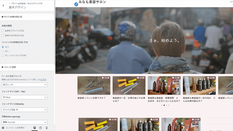
【SWELLカスタマイズ】サイト全体設定/基本デザインのやり方
SWELLをこれまで使っている方でも、この基本デザインにある項目は、変化が分かりにくいところがありませんか?
そんな分かりにくい基本デザインの設定もこの動画を見れば解決できますよ
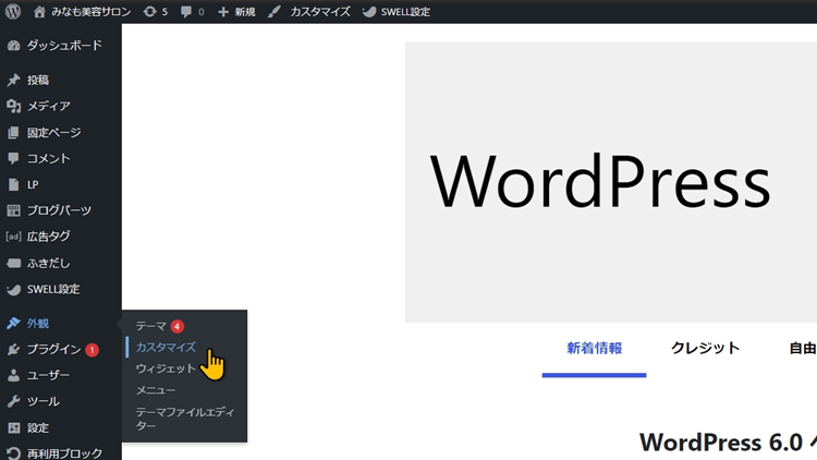
では、ダッシュボードの方から、外観にあるカスタマイズを、クリックしてください
コチラのカスタマイズの画面が開きましたら、サイト全体設定をクリック
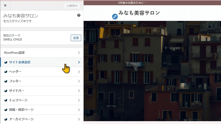
サイト全体設定が開きます
サイト全体設定が開きましたら、基本デザインをクリックしてください
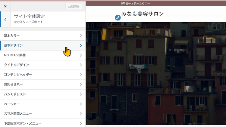
今日は、コチラの項目を解説していきます

今日は、解説する項目が多そうだね
では、上から順に解説していきますね
サイト全体の見た目
まずは、サイト全体の見た目の見出しの場所ですね
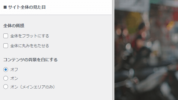
ここでは、全体の質感と、コンテンツの背景を白にするを設定していけます
実演していきますね
全体をフラットにする
全体の質感の項目の 全体をフラットにするにチェックを入れてみてください
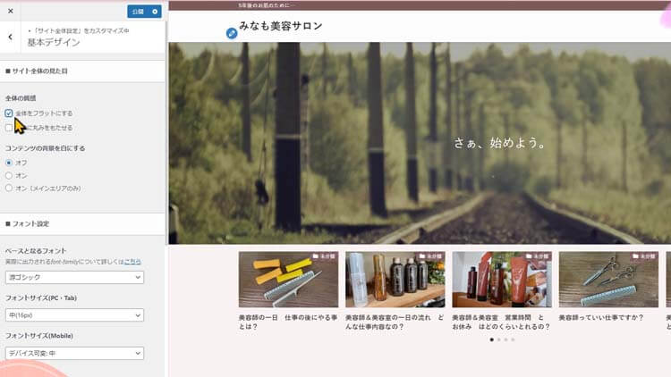
なんとなくちがう気もするけど、
か、変わったのかな?
そうね、ちょっと分かりにくいですが…
投稿リストのサムネイル画像部分など、デフォルトで影のついている箇所の多くで影がなくなります。
個人的な感想ですが、SWELLは、ここを含めこれ以外の場所でも、影やラインを出せる設定がありますが、もう少し強めの影がでててもいい気がしますね
影やラインの濃さを何段階か選べるようにしてもらえたらありがたいよね
因みに、追加CSSの項目の所から、設定できなくはないのですが、CSSの知識が必要になります
全体に丸みをもたせる
次は、全体に丸みをもたせるにチェックを入れてみましょう
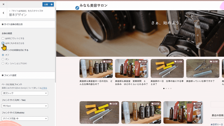
こちらは、分かりやすいですね。いろいろな箇所が丸みを帯びたデザインに変化します。
角がなくなると、印象が変わるね
一旦元に戻しておきますね
コンテンツの背景を白にする
コンテンツの背景を白にするの項目に行きます
まずは、オンにしてみます
メインエリアや、サイドバーの背景が白になりましたね
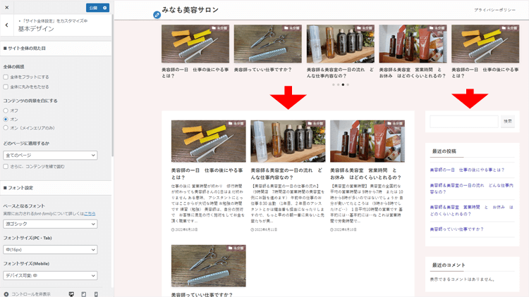
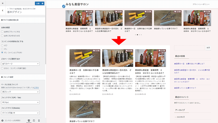
今度は、メインエリアのみオンにしてみます
メインエリアのみ背景色が白になりました
サイト全体の背景色と、本文などのコンテンツエリアの背景を分けて白色に保つ、という設定ができます。
私や、みなもちゃんのブログサイトの様に背景色を変えると、装色がしにくい面や、色遣いに迷ったりする場合もあるので、お好みに合わせて設定してみてください
どのページに適用するか
そして、コンテンツの背景を白にするをオンにすると現れる項目がありますが、どのページに適用するかでは、適応させる場所を選択できます
現在は、全てのページに設定されていますが 投稿ページのみ 固定ページのみ 投稿固定ページ フロントページ以外の5つの中から選べます
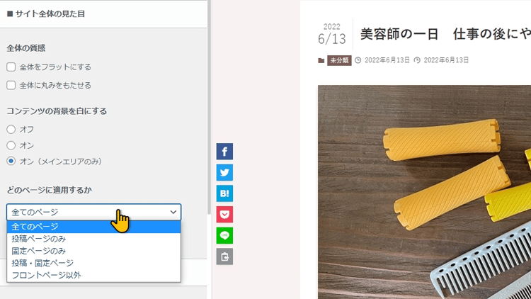
お好みで使い分けてみてください
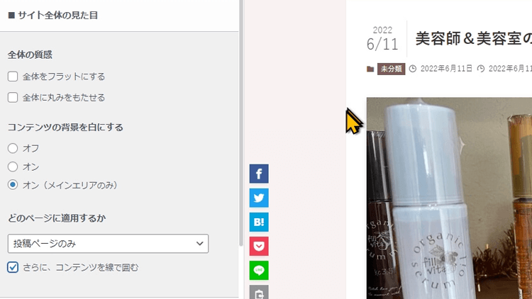
さらに、コンテンツを線で囲む
その下のさらにコンテンツを線で囲むにチェックを入れますと、少し確認しにくいですが、なんとなく印象が変わったのが分かるでしょうか?
この辺の境目に線が入ってますね
フォント設定
フォント設定の見出しの所でできる事について解説します
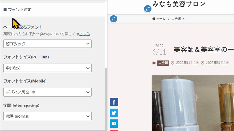
ここでは、WordPressサイト全体で使うフォントを選べます
ベースとなるフォント
こちらのベースとなるフォントで4種類からフォントを選べるのですが、サイトのイメージやブランディングに強いこだわりがなければ、フォントはデフォルトのままがいいと聞いてます。
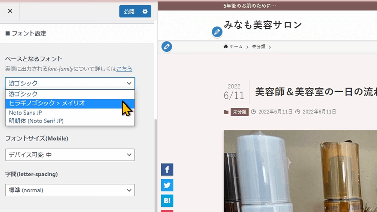
大きな差ではないのですが、デフォルトよりもやや表示速度が下がる様ですね
ただ、私がWordPressを使い始めた頃はそういわれていましたが、端末の性能や通信環境が良くなってる面を考えると、最近の端末ですと影響は誤差程度です
みんなが、新しい端末をもっているか?という点では悩ましい面はありますよね…
私のスマホ iphone7だし
そ、そだね。と言う事で、特に使いたい理由がなければ、デフォルトでいいですね
フォントサイズ(PC・Tab)
フォントのサイズも選ぶことが出来ます
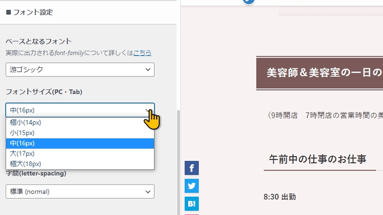
デフォルトは、16pxになっています。5段階のサイズの中から選べますね
コチラもお好みや、視聴者層を考えて選択するといいですね
ただ14px 15pxは小さくてやや見にくいですね
ブロガーさんの多くは、16pxが多いようです
因みに、私はいつも18pxを選んでます
18pxって大きくない?すこしもっさり感が…
そうね、あまり大きすぎると、もっさり感があるかもね。
ただ私は、基本的に趣味の情報発信したい人向けだったり、副業を始めたいなど初学者向けなのでなるべく視認性を高められるように、文字は大きく、ひとぶんは短く書くのをコンセプトにしてます
どんな読者が見に来てくれて、そんな読者さんが見やすい形を考えて上げると良いと思います
因みに、yahoo!のサイトもやや大きめの文字を使っているようですね
フォントサイズ(Mobile)
その下の項目ですが、SWELLはパソコン向けとは別に、モバイル端末向けに文字の大きさを設定することが出来ます
6種類の中から選ぶことが出来ます
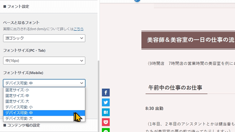
固定サイズ と モバイル可変って何かな?
スマホの横幅って、機種によってそれぞれでしょ
1行に入る文字が変わるので、機種によって見え方が変わってしまうので、想定してない文字の並び方になってしまうことがあります。
文字の大きさを優先したい場合は固定サイズの3つの中から選ぶことも出来ます
また、1行の文字数を優先する事で、文字の並びや改行の位置を安定させたい場合は、デバイス可変を選ぶといいですね
表示崩れを防ぐ分、フォントの大きさで調整するので、端末によっては文字が小さくなります
デバイス可変も3つの中から選べます
ちなみに私は、デバイス可変中にしてます
モバイル可変大にしないんだ
さすがに、スマホの画面で大にしたら、改行が多すぎてちょっともっさりしすぎた
字間(letter-spacing)
字間の項目では、4つの中から文字の間隔を選ぶことが出来ます
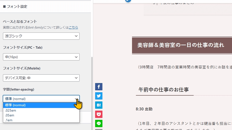
選択を変えてみると、1行の文字数が変わっているのが分かるかと思います
コチラは、標準でいいかと思いいますが、みなさんのサイトに適するように設定してみてください
コンテンツ幅の設定
次は、コンテンツ幅の設定の見出しの所を解説します
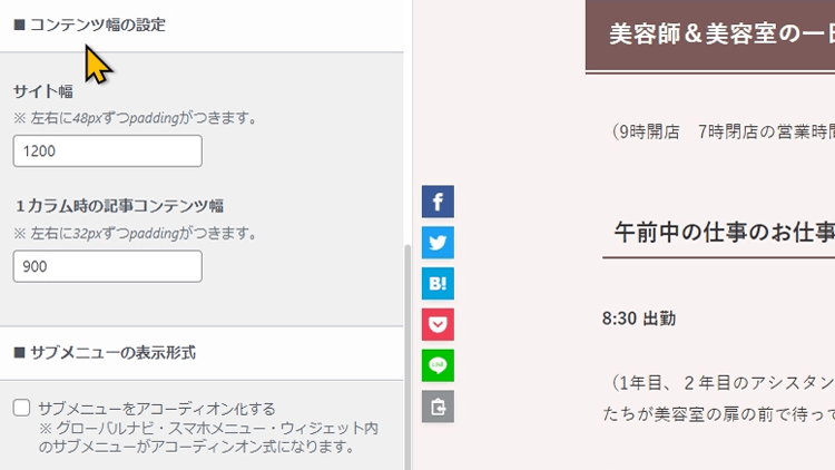
サイト幅
サイト幅は、こちらの数字を変えると右側にプレビューされるので分かりやすいですね
こちらは、メインエリア と サイドバーの合計が幾つにするかという設定になります
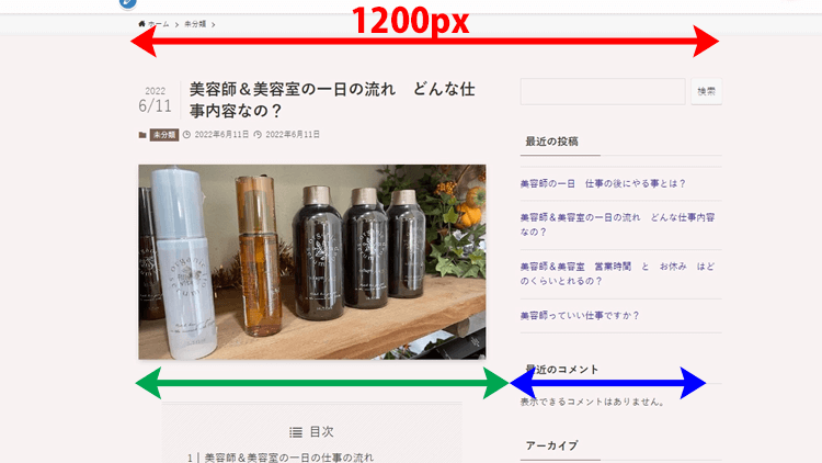
サイト幅を変えると、この様にメインエリアが変化します
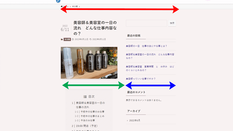
1200が一般的なので、何か強いこだわりがなければ1200のままでいいですね
小さくしたいのであれば、見やすさの下限は940PXくらいまでにしておいた方がいいですピクセル
1200pxにしますとメインエリアは900pxになります。
900pxはだいたい1行が35文字から40文字くらいになりますので、長すぎず短かすぎず、読者さんにとっても見やすい長さになります
1行が長すぎると、右から左へ目や首を動かす幅が長くて見にくいんですよね
短すぎると改行が多すぎたりするし
1カラム時の記事コンテンツ幅
下の、1カラム時の記事コンテンツ幅なんですが、こちらは数字を変えても変化がないですよね
こちらはですね、この様にサイドバーを無くした時に、メインコンテンツエリアのサイト幅をいくつにしますか?という設定ですね
こちらも特に強い希望がなければ、900pxでいいですね 下限は640pxくらいになります
今回の記事もややながくなっていますが、いつも視聴していただいてありがとうございます
みなさん、勉強熱心ですね
SWELLは自分のブログ運営だけでなく、サイト制作やWEBライティングの案件にもつながりますので、私も丁寧に説明させて頂きます
サブメニューの表示形式
コチラは、後からから追加された機能になりますね。
WordPress以外で、サイトを作られた経験がある方ならご存じのかたも多いと思うんですが、実に便利な機能なんですよ。
サブメニューをアコーディオン化するという項目があるんですが、専門用語があるので分かりにくいですよね。
どういうことかと言いますと、
SWELL公式サイトの方で、とても分かりやすい例があるのでご紹介させて頂きます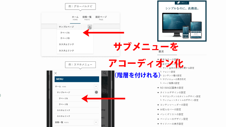
この様に、グローバルメニューや、メニューなどに階層を付けることが出来ます
グローバルメニューを付けすぎるとヘッダー周りがぐちゃぐちゃするので、階層で分けて上げるとスッキリできる効果もありそうね
これは、とても便利です
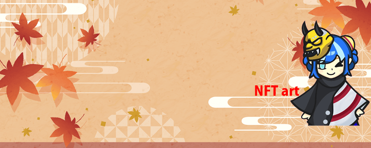
ページ背景
背景のエリアでできることは、あなたのサイトを大幅にデザインや印象を変えることが出来るので注目です
上の写真の様に、サイト全体の背景画像をパソコン向けとスマホ向けに分けて設定することが出来ます
ページ背景は、設定できる項目的には2つに見えますが、画像を設定すると、いろいろ選択が出来まして、デザインの幅もかなり広げていけます
このページ背景は、静止画だけだと分かりにくいので、自分でお試ししてみるか、動画を用意しましたので良かったら見てください(12分10秒あたりから、この項目の動画解説があります)
まずは、パソコン向けのページ背景画像から実演解説します
ページ背景画像の項目の、画像を選択をクリックして、背景に使う画像を選択していきます
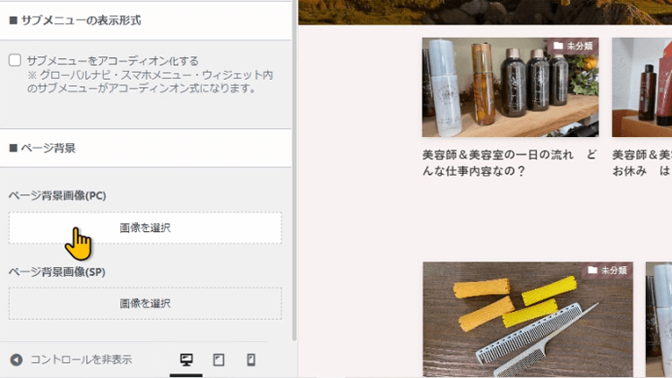
今回は分かりやすい様に、あえて小さい画像を貼って解説しますね
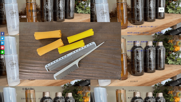
画面がすこし騒がしい感じになったね
画像が小さいので、横や縦に、1枚の画像がループするように表示されています
画像位置の項目を見てください
現在は左と上に設定されていまして、ここの画像を基準に横や縦にループしている感じになります
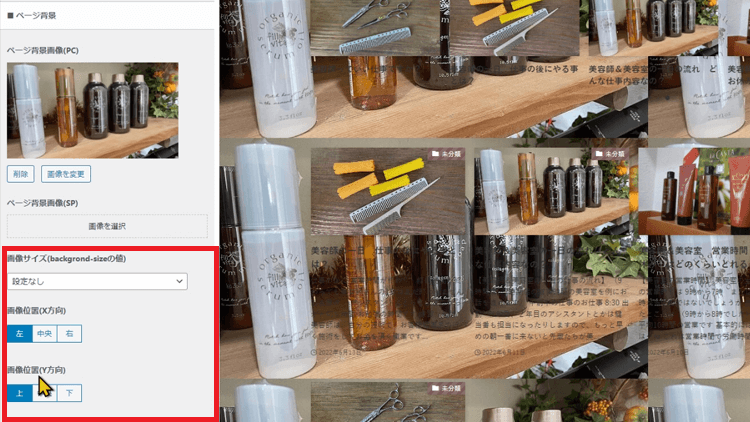
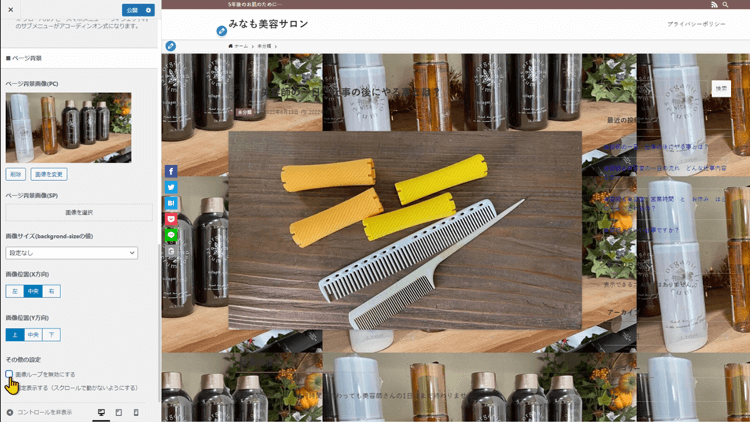
【その他の設定】の所に、チェックボックスが2つあります
画像のループを無効にするという所にチェックを入れますと…
この様に、ループが止まり、1枚だけ表示されてます
これだと、ちょっと変なので、画像サイズの項目を見てください
こちらで、画像をどのように表示するのか設定できます
まずは、横100%にしてみます
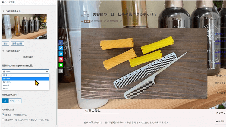
そうしますと、画像が表示画面のサイズに合う様に設定されます
また、縦100%にしますと、ちょっとわかりにくくなりますが縦100%になる様に表示されます
元の大きさに戻しまして
画像の位置を、変えてみますね
中央にしますと、中央に画像が移動します
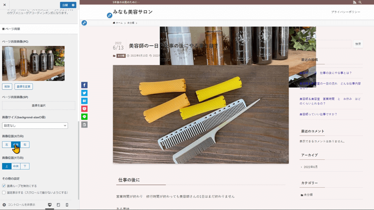
ループを有効にしますと、中央からのループになってますね
また、右にすると、右側を基準として、画像を横100%にしたり、縦100%にしたり、ループにしたりすると、画像の使われる位置が変わりますので、お好みで試してみてください
いったんもとにもどしますね
基本デザインで設定できる機能を 組み合わせてサイトを素敵に
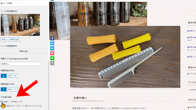
その他の設定の所にある 固定表示にするにしますと、スクロールした時に画像が動かなくなります
この設定かっこいいよね
そうだね、この項目と他の項目を組み合わせることも出来まして、動画の最初の方で説明したコンテンツの背景を白にする設定をオンにしますと、この様になります
静止画だと分かりにくいので、是非、試してみてください
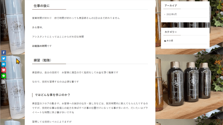
スクロールすると、メインエリアと、サイドバーが動き、背景画像は動かなくなります
コンテンツ部分は白背景で見やすくなって、その後ろに画像があると奥行きがあっていいね
そうだね、かなりスタイリッシュだよね
この基本デザインの場所だけでも、かなりデザインの幅をもたらせることが出来ますね
同じように、スマホ向けのページ背景用画像の設定は、コチラの項目から画像を選択しますと、設定していけますのでやってみてくださいね
全ての設定が終わりましたら、カスタマイズを離れる前に、公開をしておきましょう
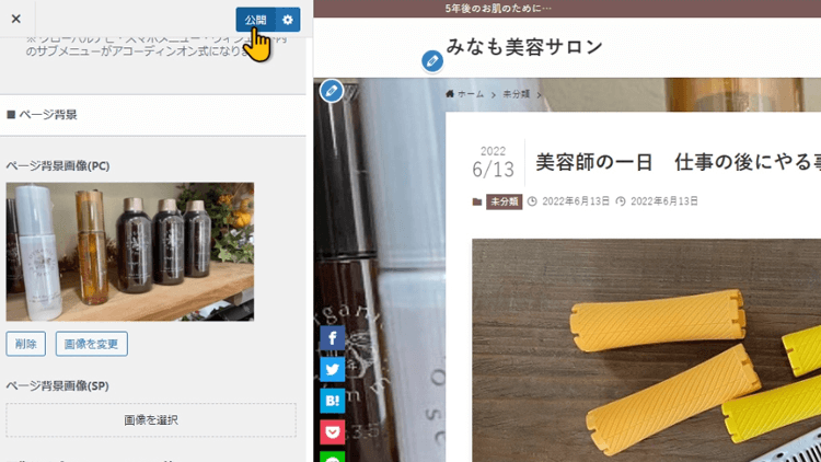
公開しておかないと、設定が保存されていませんので、せっかく設定したものが消えてしまいます
今回は、【SWELLカスタマイズ】サイト全体設定基本デザインのやり方と、色の効果について解説させて頂きました
その他、SWELLカスタマイズに関して以下の記事を執筆しました
【動画版】 基本デザインのやり方 も作ってあります
この記事に関連する【SWELL公式サイト】WordPressを運営していると、WordPressやSWELLのデザインや設定を少し変えたい時があると思いますよね?でも、だけど、あれ?この機能の設定ってどこで設定するんだっけ?って思う事ありませんか?
そんな時に、すぐに解決できるように、私のチャンネル内検索で答えが見つけられる様に、一問一答的な動画も作って行こうかと思います
SWELLの設定で困った時には、辞書の様に使えるYouTubeチャンネルにしていきますので、是非、今のうちにチャンネル登録していただけると嬉しいです
見てもらえる人が増えると、動画制作のモチベーションが上がります
最後まで見て頂きまして、ありがとうございました